

I like to think that my creativity peaks when it is in service to extremely narrow constraints. If given an endless canvas with limitless possibilities, my imagination often fails and I become encased in writer’s block. I used to have a podcast and it ‘scratched the itch’ for awhile but ultimately I ran up against a boundless sea of choices and chose nothing.
I believe that art (and genius) can be found in a variety of forms and contexts and frankly even capitalist greed has its own form of creative, artistic expression. I recall a conversation that Ricky Gervais had years ago discussing one of the few truly free creative forms of expression in modern times is television advertisements. Crazy as it sounds, in some marketing departments the artists are given quite a bit of latitude to make something that will improve their brand’s image. I feel like the vast majority of what Nike puts together, for instance, was not decided by a board of trustees insofar as they described what they want their brand image to be and the artists set about creating the sequence of colors, images, sounds, etc. that would implant that image into the viewer’s imagination.
Its in this vein that much of my own creativity has flowed. While extremely terrible at generating an original logo or image or creative thought, I am extremely good at taking an existing body of work – whole or partial – and building its essence into something better or perhaps more ‘pure’ (?) than its original state. As a retail worker I excelled at creating genuinely eye-popping merchandising displays when given constraints to work under. Shelves below pegs. Aisles have to lead with pegs, end with shelves. Wall displays had to have peaks toward the center or middle-third and valleys that run toward the sides. I have x amount of this product, x amount of that and x amount of resources (shelves, supports, signs, etc.). It was truly exhilarating and I enjoyed putting up hundreds of canvasses over the years that grabbed peoples’ attention and held their gaze to take it in, even if they never touched an item on the display.
Depending on your perspective here – and this is a theme with me – the decision to not even touch anything on that wall is a failure or not indicative of anything. I think my argument is similar to the one that Timex had with its watches that would be pictured on top of mountains, at the north and south poles, or in extreme conditions anywhere. ‘You’re not going to climb Everest, but isn’t it nice to know that if you splash some water on it, its going to be just fine.’ A dazzling display of products you would never consider buying lends just that little greater sense of credibility to the choice of product you are actually going to make and seeing an entire department or store given the same care and touch regardless of the category is assurance that you are, in fact, in the right place. The company I worked for also had an extensive collection of treadmill displays, with the highest-end sporting a price tag over 10x what the lowest-end had. But again, you do not bring in the expensive hardware to sell it like hotcakes. Its presence as an industry-leader in its category broadcasts to anyone looking for a treadmill that this place knows what its doing and the curated choices you have for less are probably the best in their categories, too (even if they were not).
I have since shifted industries and would say that my previous experience in merchandising helped me deal with constraints but there is also an important aspect of function at play here, too, and its feeding into an on-again, off-again interest of mine – UX design. Its not enough to make a beautiful display, it has to also function and be ‘shop-able.’ If you were to have say, a wall of scooters that had shelves going from floor to ceiling, then whatever scooters were on those top shelves had to also be available lower down where they were in arm’s reach of a shopper. A frequent tactic was to ‘dummy stock’ the top with the empty box of the display (and nothing behind it). I also made a habit – when aesthetically possible – of placing the product we had the most of at roughly eye-level, an old grocery-store tactic, to ensure that specific model, color or choice was given maximum spotlight and chance of being sold. Never a bad idea to put your highest-markup items at this prestigious location as well.
As I am now working with software and technology and user interactions with operating systems, the design philosophy has changed and it never fails to amaze me how poor some very, very large companies are at the absolute most basic UX design. The entire concept of feedback seems lost on many companies, with interfaces that appear to be doing absolutely nothing only to suddenly change. Feedback is important! Its why when you click on a link, a little dotted line appears around the link. It gives confirmation that it was selected (and you don’t have to click it again because you are not sure if anything is working). There are websites out there trying to ‘revolutionize’ site design by making them click-less. While I am all for accessibility and building in alternate views for the variously-abled users in the world, the bog standard interface should incorporate basic feedback to inform the user something happened.
Your mouse clicks. Why? Because you need to know that pressing the button actually did something. The trackpad on your laptop has a similar function. Macbooks actually have a haptic feedback when you click on something. Its quite subtle and frankly genius because it definitely makes it feel like you pushed down on the trackpad and it dropped, clicked, and moved back up. But turn off your Mac and you’ll notice that sensation is missing. Yeah… that’s a simulated experience! Instead of removing feedback, Apple designed something that intended to improve upon it. While I like it, I’m not as much a fan of the secondary click that comes from ‘additional pressure.’ But I also have clumsy fingers.
I find myself designing an interface and an app all of a sudden and the constraints – living within another app, knowing when to advertise to the user that its available – are frankly setting my mind on fire. Perhaps this is also was entrepreneurs feel when they look at an existing process and realize how deeply flawed it is only to set about improving it. I do not have the experience or eye for that skillset but I certainly have an eye for design.
One final anecdote about design – again, which I consider art regardless of the context – is lifted from a book I keep starting, stopping, and restarting again – the Design of Everyday Things by Don Norman. Even if. you are not interested in becoming a designer, its a fantastic book that really gets at the spirit or essence of things and helps inform your understanding of what an app or product is trying to get you to do.
A well-designed item should not require a manual to use. Someone should be able to walk right up to it and begin using it for its intended purpose immediately, and ideally without any words written on it. Norman’s best example is a door. I mean… its pretty hard to screw up door design right? Well…
A ‘Norman door’ is something I encounter every single time I go into a specific gas station near my house. I go often enough that I know how these doors function but its not readily apparent to someone who is encountering them for the first time or very intermittently. Generally speaking, if a door has the words ‘Push’ written on it, then someone just gave up on the design. If it says that, its because there isn’t a clear indicator on the ‘push’ side of the door’ that it has to be pushed nor is there a clear indicator on the ‘pull’ side of the door that it has to be pulled. In the interest of saving money, the door is perfectly symmetrical on both sides, so there are something like three bars running horizontally across both sides of the door meaning someone thought they were being very clever and designed something that can be both pushed and pulled and so the manufacturing process is cheaper since the door requires one less custom part to be built at the factory.
But a user walking up to a door needs to work out:
- whether this door should be pushed or pulled on and
- which side needs to be pushed on or pulled from
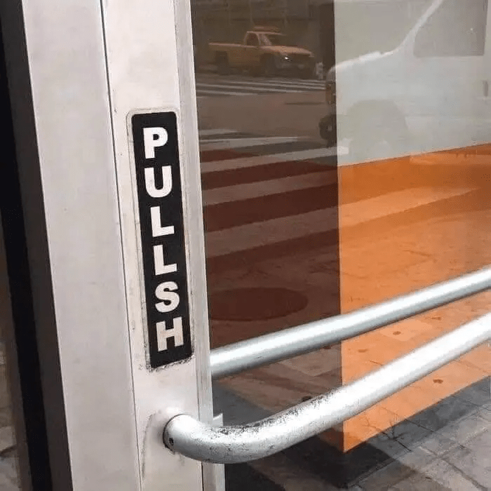
This image is cropped (and hilariously editorialized) so you cannot tell that this door is actually a less egregious design. The side that needs to be pulled from sticks out farther than the other, so the hinge is assumed to be one the right side (going into the building). Here is the actual photo:

The issue, of course, is if the bar on the outside and the inside are both the same, it is not immediately obvious whether you need to push or pull to get in to this building. The inclusion of the ‘PULL’ sticker is proof that indeed, it cannot be reasonably assumed without a visual aid and without it, plenty of people would be embarrassed as they tried to push into the building only to be abruptly stopped with varying degrees of severity.
Similarly, incorporating something into your UX design for software that provides feedback or a natural interface that someone can use without having to look it up or use a manual, is extremely important. Obvious processes for starting, stopping, pausing, etc. that do not require any hidden knowledge. This is a rare piece of design insight as many designers are putting together software on the basis of familiarity with an operating system or worse, cultural knowledge. The best designs use innate human thinking as the triggers and take into account the psychology of decision-making and interaction.
Wish me luck!
